Things That Will Stay
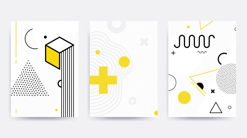
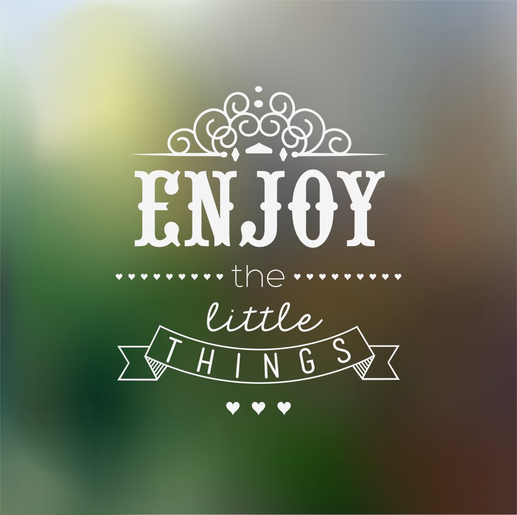
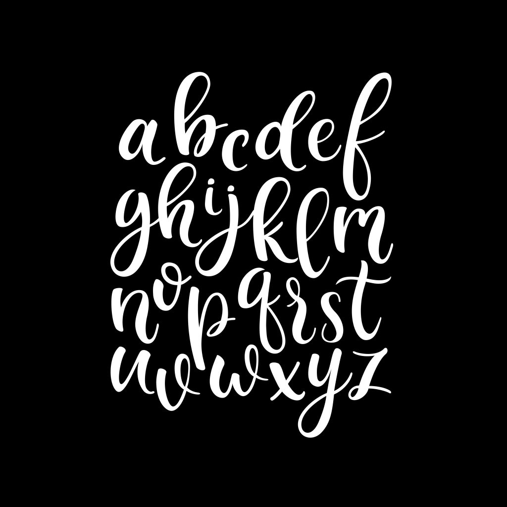
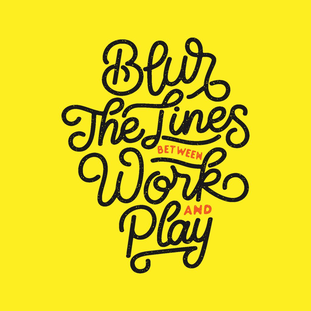
We have a soft spot for typography. It feels like an art form that carries on through time, adapting in exciting ways. It also allows for plenty of creative expression and originality.
In 2017, we saw a lot of cropped typography, the dropping of vowels to minimise (see above paragraph), and imagery as text. In 2018, artists will likely push the originality side even further. Attention-grabbing, smart, typography that stands out from the pack will be the goal. If you are interested in keeping up with the happenings, we recommend following the #typography feed on Instagram (yes, you can follow hashtags now).
Things That Will Improve

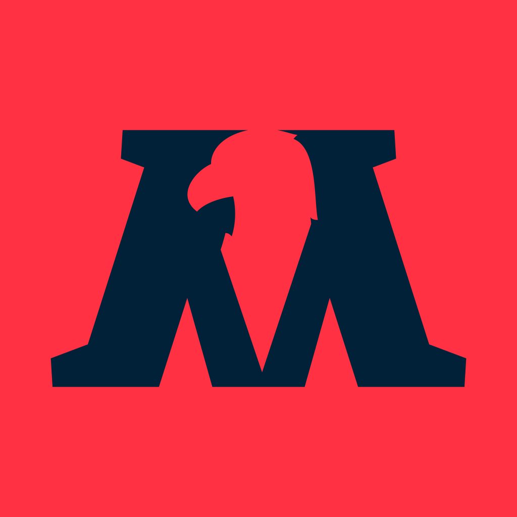
People seem to be getting trickier with negative space. This is a blank part of the design that forms an image or shape. We expect to see a lot more designs utilising this method as the year progresses. This particularly great when combined with Typography, for example, an image revealed through wording or forming the text shape. Don’t be afraid to use bright colours this year either. Let your designs brighten someone’s day, but use restraint and keep the number of different colours to a minimum.
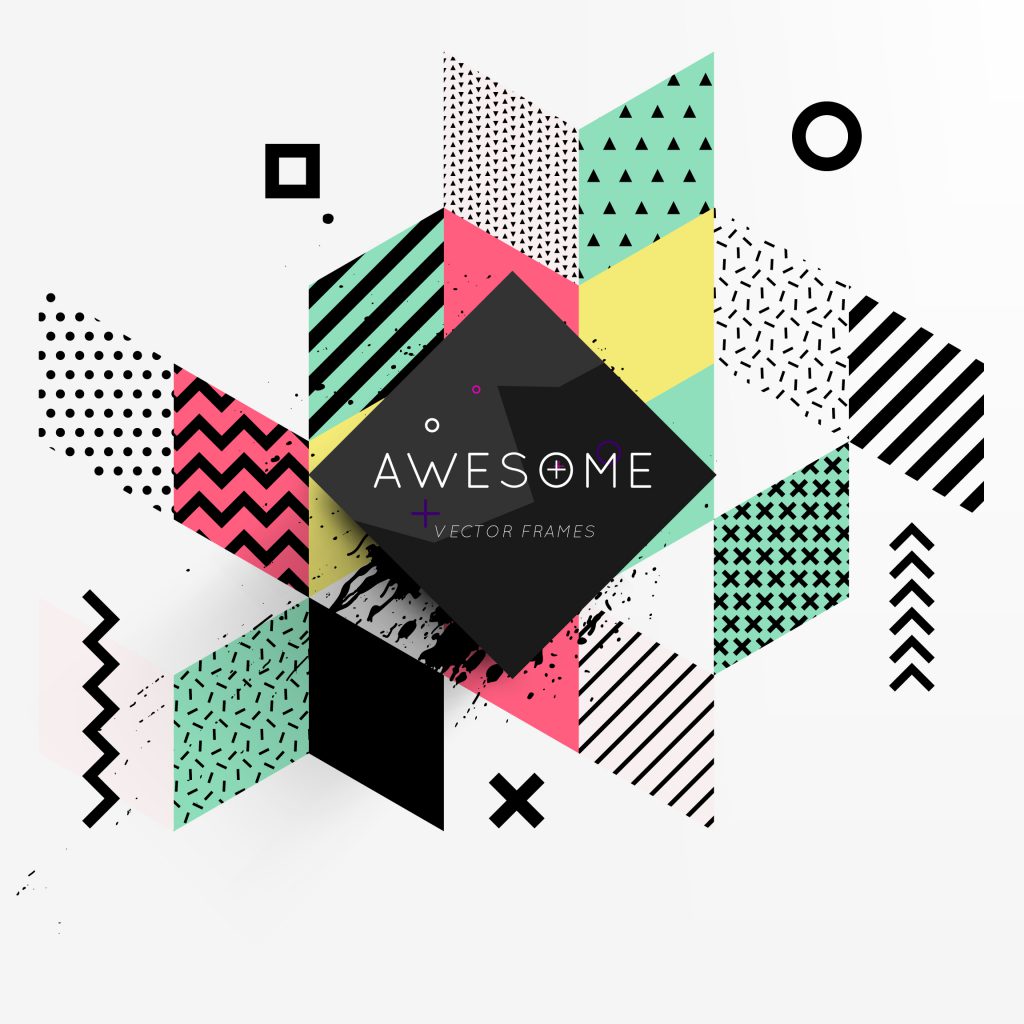
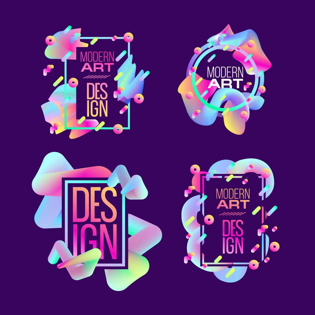
Colour schemes will follow the trends of fashion (undercuts and washed denim) and TV (Stranger Things anyone?) with a return to the 1980/90s. This means bright hyper-colours and light-toned pastels. Think slap bands and happy pants for inspiration. Keep in mind not to get carried away, the new age twist to this revitalisation will be to keep things minimal. Only use one or two colours and don’t overdo the shapes. Be sure to remember that the kids who grew up with this stuff are now the decision making adults.
Things to Consider
3D modelling is something that has always been around, but it’s never really blown our minds. We’re guessing that it may do exactly that this year and we’re already off to a strong start with Dolby’s new 3D campaign by artist David McLeod. The trick here will be to maintain the sparse, minimal colour approach, letting the 3D effect do most of the work in catching the eye.
Not sure if we can call this next one a trend, it’s more of a requirement. Responsive design is a must thanks to the rise of various devices. Last year in the UK mobile usage was more popular than any other format with 92% of users opting for the smaller screen. This means the design and layout of your website has to work well on phones and tablets, not just PCs. Ignoring this crucial element means users will get frustrated and look elsewhere.
Outside of visual elements (as design isn’t just how something looks, it’s also how it works), expect things to need to be even easier than before. People will grow more impatient and expect technology to save them even more time which they can spend on cat videos. Forms will need to be better configured to work with Apple’s auto-complete function (make sure first name and surname don’t end up in the same box), and the more clicks you can save your customer the better.
We can’t wait to see what happens with design this year! Hopefully we are completely awe-inspired by the work that comes out (including that of our own). Remember always to push the boundaries. Be original and help to raise the bar as a member of the design community. Happy 2018, we hope it’s great for you!

